
- resume
- press
- artist statements
Education
Wayne State University, MA 1972
Central Michigan University, BS 1968
Solo Exhibitions
2008
Oakwood Hospital Main Gallery - Dearborn, MI
2004
Solo Exhibition - Designhaus Gallery, Rochester, MI
Solo Exhibition - University Liggett School, Grosse Pointe, MI
2003
Solo Exhibition - University of Michigan Hospital - Main Gallery, Ann
Arbor, MI
1999
Solo Exhibition - Cary Gallery, Rochester Hills, MI
1986
Solo Exhibition - Union Square Gallery, New York, NY
1977
Solo Exhibition - Macomb Community College
Group Exhibitions
2014
National Juried Exhibition at the Saint Vincent Gallery – The Annunciation - 20 X 30 Watercolor
Birmingham Bloomfield Art Center Michigan Fine Arts Competition – Guardian 54 X 60 Acrylic
Mercedes Benz World Headquarters Exhibition – Four Stations – 54 X 60 Acrylic
Michigan Watercolor Society Exhibition – Four Chairs - 20 X 30 - Watercolor
2013
Two person retrospective exhibition at University of Michigan, Duderstadt Center Gallery (add this above current listing)
2010
Scarab Club Photo Exhibition - Juried
University of Michigan / Dearborn - All Media Exhibition - Juried
Paint Creek Center for the Arts - Ceramics Exhibition - Juried
University of Michigan - Open Competition, juried exhibition
2009
Scarab Club - Photographic Exhibition - Juried
Michigan Watercolor Show - Muskegon Museum of Art
2008
Exhibition of Abstract Photos - Dec. 08 - Cary Gallery, Rochester, MI
Michigan Watercolor Show - Jackson Museum of Art - Traveling Show. Central
Michigan University - Invitational "Visual Narratives: Reading Between
the Lines"
2007
Birmingham Bloomfield Art Center - Faculty Show
Michigan Watercolor Show - Wayne State University
2006
Detroit Artist Market - Invitational
University of Michigan Hospital Gallery - Mandalas
2005
Circles of Life and Being - Mandala Invitational
Rochester Invitational - Cary Gallery
427 Gallery - Northville Michigan
2004
Birmingham Bloomfield Art Center - Juried
Michigan Watercolor Show
University of Michigan - Juried
The 8th Annual All-Michigan All-Media
Birmingham Bloomfield Art Center - Juried
Michigan Fine Arts Competition 2004
2003
Lawrence Street Gallery - Juried
Celebrate Clay 2003 - 2005
The Mt. Clemens Art Center - Juried
Michigan Annual XXXI
Paint Creek Center For The Arts - Invitational
20th Anniversary Celebration
2002
Paint Creek Center For The Arts - Juried
Painting as an Abstraction
Mt. Clemens Art Center - Juried
Michigan Annual - Honorable Mention
2001
Oakland Community College - Juried
Helen DeRoy Exhibition - Purchase Award
Ann Arbor Art Center - Juried - The Annual All Media Exhibition
Central Michigan University - Alumni Invitational
Michigan Watercolor Show - Cash Award
Pontiac Creative Arts Center - Juried Show
2000
Scarab Club - Cash Award
Our Town - Birmingham, MI
1997
Clay Dominant - Detroit Artist Market - Juried Show
1996
Two Person Show - Cary Gallery, Rochester, MI
1995
New York Film Festival - Finalist
1994
Hometown Video - National Award
1993
Telly Bronze Video Award - National Award
Central Michigan University - Centennial Exhibition
1988
NFLCP National First prize Video Award
1984
Michigan State Arts Council - Creative Artist Grant
1980
Mt. Clemens Art Center - First Prize Painting
1979
Michigan Watercolor Show - Oakland University
Macomb Educator Show - First Prize Painting
1972
Ann Arbor Film Festival - First Prize, Best Documentary Film
1968
Detroit Institute of Art - Michigan Artists Show
1967
Flint Annual - First Prize, Drawing
Collections
Central Michigan University - Permanent Collection 1980
Mr. Dan Arnold, Madison, WI 1982
Mr. & Mrs. Taro Yamasaki, Birmingham, MI 1983
Mr. John Hallman, New Symrna Beach, FL 1986
Mr. Don Bemis, Utica, Michigan 1989
Mr. & Mrs. Pierce Getsinger, Lake Orion, MI 1989
Mr. Todd Weinstein, NYC, NY 1991
Mr. Allan Cary, Allan Cary Gallery, MI 1998
Mr. & Mrs. Brian Russell, Oxford, MI 1998
Mr. & Mrs. Franco Constantini, Rochester Hills, MI 1998
Ms. Ruth Winter, Flint, MI 1999
Mr. & Mrs. Kim Yamasaki, Lake Orion, MI 1999
Mr. & Mrs. Angelo Chili, Vail, CO 2000
Oakland Community College - Helen DeRoy Permanent Collection 2001
Mr. & Mrs. Barry LaKritz, West Bloomfield, MI 2004
Mr. Peter Strublreyer, Rochester, MI 2004
Mr. Bruce Campbell, Jacksonville, OR 2007
Mr. & Mrs. Gary Shephard - 2009
Mr. Joe Pinon, Ferndale, MI - 2009
Dennis A. Nawrocki
Ron Teachworth: Abstractionist and/or Realist
One of the remarkable and consistent leitmotifs in the oeuvre of Ron Teachworth over the years is the unmistakable dominance in his paintings and watercolors of either a sky or pure abstract field of color and pattern. Combining the two terms, this phenomenon might be aptly described as a “sky-field.” That is, in his realist world of seascapes and landscapes what one reads as sky becomes in the non-objective images a flat, abstract field (or ground or plane). Though his paintings are mostly modest in scale (ranging in size from 2 x 3 to 3 l/2 x 5 feet), the skies in his sea- or landscapes feel vast, dwarfing the beach, land, trees, lifeguard stands, man standing on his hands, or pole-like markers, all of which populate and humanize the artist’s representational scenes.
However, even in the abstractions that are seemingly devoid of naturalistic references, the geometric shapes (triangles, diamonds, parallelograms, etc.) are animated by tiny lozenge shapes, confetti like squiggles, or blips or daubs of pigment that recall star-studded firmaments, northern lights, or concentric planetary auras. These colorful, molecular elements, visible in both bodies of work, skyscapes and abstracts, tame and intimize these sky-fields and, interestingly, tip the realist paintings toward abstraction and the non-representational examples in the direction of naturalism.
Teachworth’s geometric shapes are, by the way, just quirky, skewed, and off centered enough to further enliven the field paintings. (In the sky views the heavens are usually symmetrically disposed.) Impastoed surfaces and vibrant color energize these paintings as well, whether the more or less accurate local color of the sea or land views or the kinetic clashes and calming harmonies of the abstractions.
Despite the mysteriously animated movements that go bump in these sky-fields, Teachworth’s paintings project a serene and pacific mood. These contemplative compositions are engendered largely by the carefully calibrated proportional relationships between the geometrical forms and the frequently dense, always lively patterning displayed both within and outside their perimeters. Indeed, the artist brings a kind of order to our expanding universe by his segmenting and patterning. The realist works share this quietude as well in part because of the small scale of the represented elements and the spare (one or two per composition) employment of his vocabulary of lifeguard chairs, markers, or figures. Notably, what all the depicted items share is verticality, thereby functioning as wee but emphatically upright indicators of human presence in a seemingly infinite macrocosm.
Thus, just as the diminutive figural, structural, or organic (trees deployed in orchard formation) components suggest human life (albeit a minuscule one), the segmenting and patterning within the non-objective compositions imply as well a human drive to impose order onto the cosmos. This metaphysical balancing act, sensitively and persuasively embodied in his paintings, lies at the core of both Teachworth’s life and art.
Dennis Alan Nawrocki, April 2004
Nate Cavalieri
Of Maps, Mandalas, and Distant Fields
If Ron Teachworth's paintings are windows on the exotic terrain of the imagination—infinite seaside horizons, spectacular night skies, and fields of vibrantly stippled geometry—it's possible to see his mandalas as furtive maps to those distant worlds. From an inch away or across the room, the circular paintings and sculptures are trying to tell us something; they are compasses trying to direct us somewhere.
The signals occasionally seem obvious: arrows lead us to the rough clay edges of some, and many find crosses at their center (a symbol which, like the mandala itself, could be associated with the religious dogma of your choosing). In others, the compass is thrown off by a fragmented letter, repurposed scraps of metal, or brilliantly colored sticks.
Certainly, Teachworth's dedication and repetition of mandalas proves him a committed student of Carl Jung, who first brought the form into Western consciousness. Jung himself obsessively created mandalas during meditation, attempting to "make maps" to the center of himself.
But Teachworth's maps and meditations pursue larger explorations than the long-sought “self”—even if the mandalas rarely eclipse the size of a dinner plate. With brightly colored, fleeting lines, his drawn mandalas spin the ancient form into the hustle of present-day, while his rough hewn mandalas of mixed media – pressed into clay, mounted on slate, and framed in wood—appear as primeval relics.
If they seem to be directing us to different ends of a timeline, when they appear next to Teachworth’s paintings, the mandalas’ direction becomes clear. His earliest acrylics—serene destinations with titles like “Orchard Trees” and “Blue Water Beach,” all in pointillist textures which bring to mind carefully placed patterns of tic tacs—depict languid afternoons of gently surreal, time-forgotten tranquility. Some of his whimsical watercolors find figures at play, but most of these scenes suggest a recently absent human presence. We're invited to curiously deserted lifeguard chairs, shady trees, and colorful burial markers, but Teachworth’s scenes never seem forsaken.
The objects at center seem just as carefully placed as the swatches of color enlivening the surrounding atmospheres. Eventually, as with the casually suggested horizon of “Pyramid Beach,” or the hazily rendered mountain range of “Twin Peaks,” the bright geometry of these atmospheres demands our complete attention. It's as if, overtime, we’ve taken perch in the abandoned lifeguard chair, looked skyward and let our minds do the rest. The energetic mélange of color and shapes that dominates his later work needs little tie to earthly constructs.
Arriving at a recent painting like “A Cross for Helen & Vern,”
its hard not to see the lambent shape at the center of the green and blue
turf as a sideways X that marks the spot after long travels. Looking at
it long enough, it appears to be the enlarged symbol on a map, as if the
journey is about to begin.
Nate Cavalieri, San Francisco, CA 2006
Artist Statement
I graduated from Wayne State University in 1970 with an MA in Painting.
I have been producing visual art in the Detroit area since 1968, and this includes producing artwork using a variety of different media. I was born in Detroit, and I have resided, gone to school, and exhibited extensively in Detroit. I have always considered myself part of the Detroit Art Community.
Until recently, I have been represented by the Lurie Gallery, in Miami, Fl. and Beverly Hills, CA.
The body of work that has recently dominated my time and energy is the watercolor on paper. These paintings have a narrative and are representational. This work (usually) contains a metaphysical element that I use to create a sense of mystery. Some of the subject matter has been influenced by my travel to Puerto Rico, and Cuba, where I have taken digital pictures of images that resonate with me. A composition usually comes from a conglomerate of these images. I spend much of the time considering the elements of the composition, followed by the use of color, space, and light. In addition, what has developed in these paintings is the idea of placing a painting of mine into a new painting. When complete, the painting is scanned on a large bed scanner. I have experimented with printing the “Giclee” larger than the original. The original is often 24 X 34”, and I have made one digital print of that image that is 34 X 48
The early origins of my watercolor paintings started as landscapes in the 70’s and they have accelerated recently with multiple exhibits. I have completed about 80 pieces of this type work.
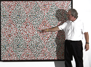
A body of work that I have exhibited extensively over the years is what started out to be landscapes (acrylic on an easel) in the 70’s and evolved to abstractions around 2000. These paintings are color field paintings using a stroke of paint that has evolved from landscapes with surreal skies to large (50X70) flat fields of multiple color. I have completed approximately 75 pieces of this type of work.
Another body of work has been the creation of Mandalas, both drawings and ceramic pieces. The Sanskrit word Mandala means, "circle" in the ordinary sense of the word. The Mandala is fundamentally a visual construct that is easily grasped by the eye, for it corresponds to the primary experience as well as to the structure of the organ. To the western world, the popular reintroduction of the Mandala concept can be specifically traced to the work of Carl G. Jung, who rediscovered the Mandala as a basic structural device in the alchemical tradition of the West, and as an integrative art form used by individuals as part of a process he called individuation. I simply wanted to create my own Mandala.
I find in making / creating visual art, it is helpful to have a primary focus that occupies the majority of my thought and time, but I have also found it useful to have a secondary focus the occasionally provides for a respite from the main body of work. I use the Mandala work for this purpose. I have completed 30 pieces of this type work.
The last to mention would be the film work. I attended the London Film School in the early 1970’s and worked in the film / TV industry as a way of making a living. In 1984, I wrote and directed a feature film for Vestron Pictures, Going Back that received critical acclaim and good reviews around the country.
I was disillusioned by the film industry and quickly returned to my studio to make visual art. I have produced a nine-minute film recently where I talk about making art, currently available for viewing on my web site (see Video).
All my work has evolved in a personal way, and I believe in a theory developed by Joseph Chilton Pierce that says our imaginations are shaped by our play experiences between the ages of 6 and 12 years of age. My ability to generate a new idea for a piece of work comes from a highly developed imagination, travel, and my daily experiences. In addition, I have been a student of Carl Jung for nearly twenty years and I adhere to his Theory of Psychological Type, and the Collective Unconscious.
When it comes to interpretation, I do not analyze nor intellectualize the meaning of my work. What I see in a painting and what you see in a painting may be entirely different. This is the quality in art that makes it very special, be it a short story, a poem, a painting, or a piece of music. Artistic analysis cannot force the viewer to find what he or she does not see. An artistic statement is a little like asking the artist, what does it mean? My position is the meaning of a piece of art is very different for each viewer and largely based on his or her experience.
My goal is to bring the viewer back to the experience, again and again. As simply as possible, I want to create a sense of mystery using space, light, color, and composition.
www.ronteachworth.com
Ron Teachworth in his studio, Rochester Hills (2007)